responsive website design | UI Design
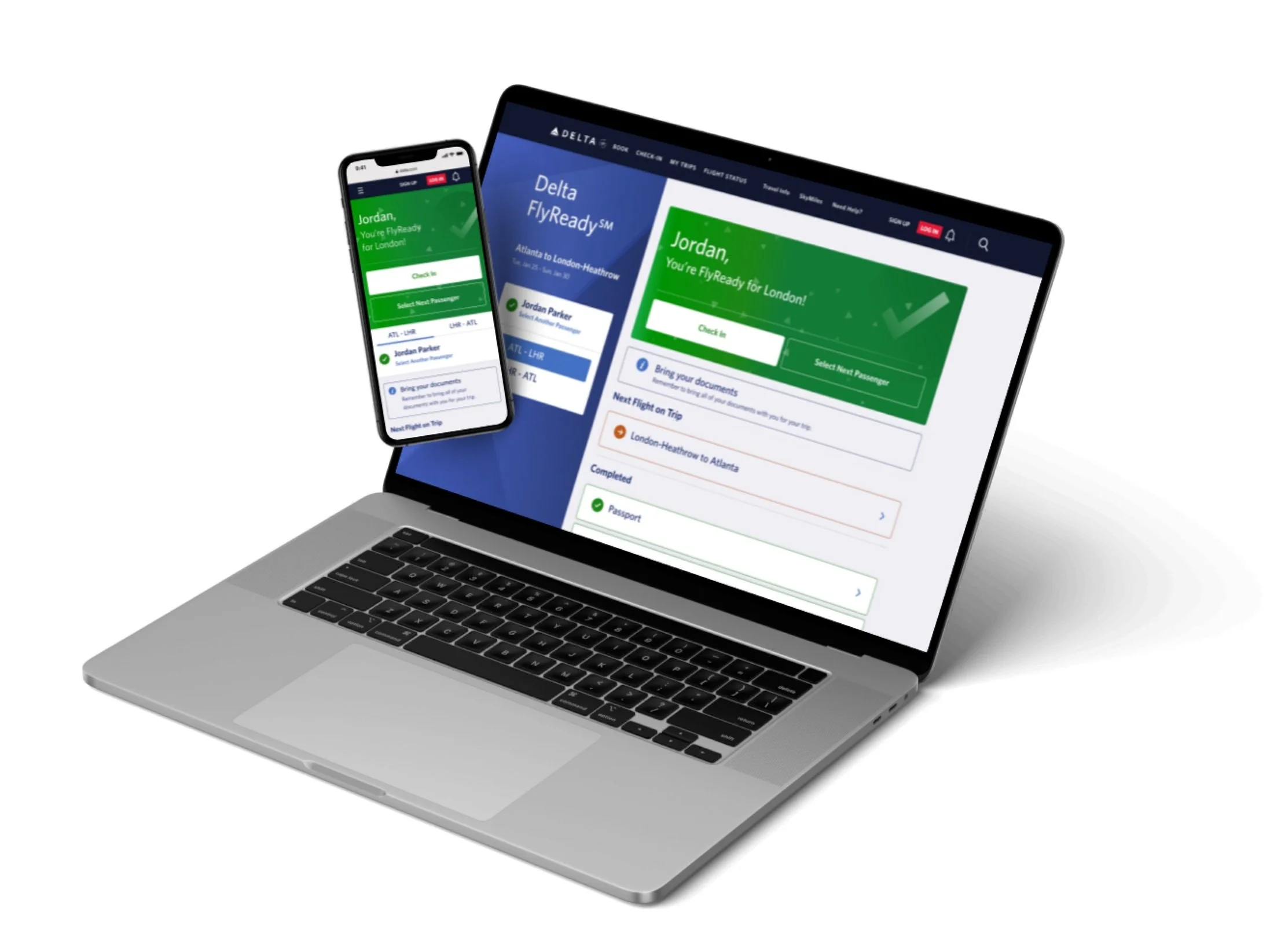
Delta FlyReady is a simple, personalized, and faster way to manage international travel requirements, guiding you through each step and confirming you’re ready to go before heading to the airport.
The Brief
COVID-19 changed the way that customers traveled internationally. During and post-pandemic, many countries required proof of vaccination/ negative COVID test and government form to enter into their country. This created a more complex travel experience for users and many had to research on their own to figure out what documentation was required prior to their trip.
Delta wanted to make this experience simple and easier for customers traveling internationally. We were tasked with creating a simplified platform that would gather all travel requirements and allow users to upload everything right to the website for an easy day of travel.

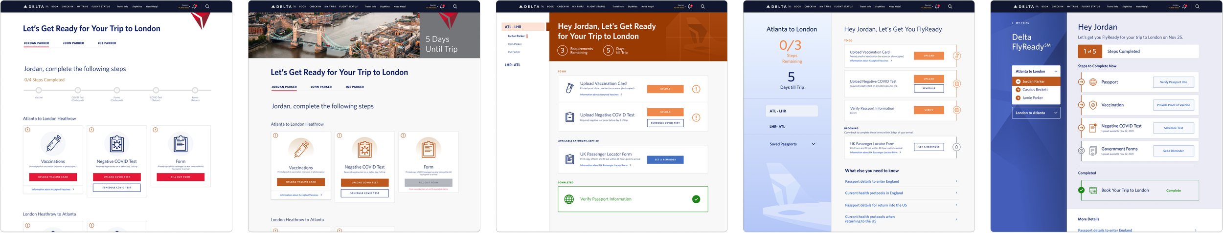
early Homepage iterations
Process & REvisions
The project began with solving for how to make complicated new travel requirements seem quick and easy with just 3-4 steps. Early iterations of the homepage circled around how can we make FlyReady feel like an easy 1-2-3 checklist. Initial designs leveraged the Delta branding keeping the main colors navy blue, red and white and then a deep grey. I created some initial iterations utilizing a progress bar at the top to show users how its only a few simple steps to complete. Progress bars were also used throughout the Delta website, like within the shopping flow, so it remained consistent with the brand. Iconography was a big part of the early iterations. I wanted to bring visual interest to the steps so it didn’t feel utilitarian.
As the weeks progressed, we were asked to deviate away from the Delta branding. We wanted FlyReady to be a standalone system that felt likes its own. This led to bolder color choices with larger swaths of orange and blue. A new FlyReady style guide was soon created with new button stylings, colors and card treatments. he cards for each step became simplified the longer we iterated. Overtime we realized that we wanted the homepage to be as simple as possible and to not overwhelm users with too much information.
Final Homepage Design
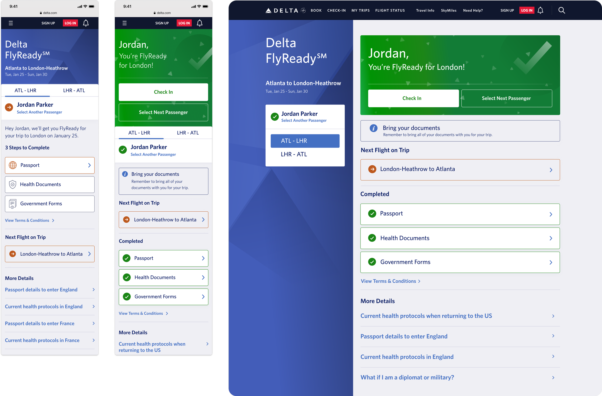
The final designs settled on 3 simplified cards for each step of the process and a visual left rail/top section of the page with more visual Delta branding included. Color & iconography was used to show users which steps users needed to complete and which were completed already. Due to the fact that a user passport was required to compile travel requirements based on the users citizenship, the health documents and government forms cards are disabled until passport information is entered.
As users move forward and complete steps, the completed steps are moved to the bottom and highlighted in green. The orange color is used to show what has not been completed and if a button ever turns red, that indicates to users that something with their forms are wrong and if unresolved they will not be permitted to fly (for example if a user uploads a positive COVID test).
Once users have completed all of their steps, a celebratory moment is created at the end of the process. The green card at the top notifies users they are good to go with a large checkmark and a confetti animation. Users can then check into their flight if they are within the 24 hour window or can move onto another passenger or flight to get ready for.

early Modal iterations
Process & REvisions
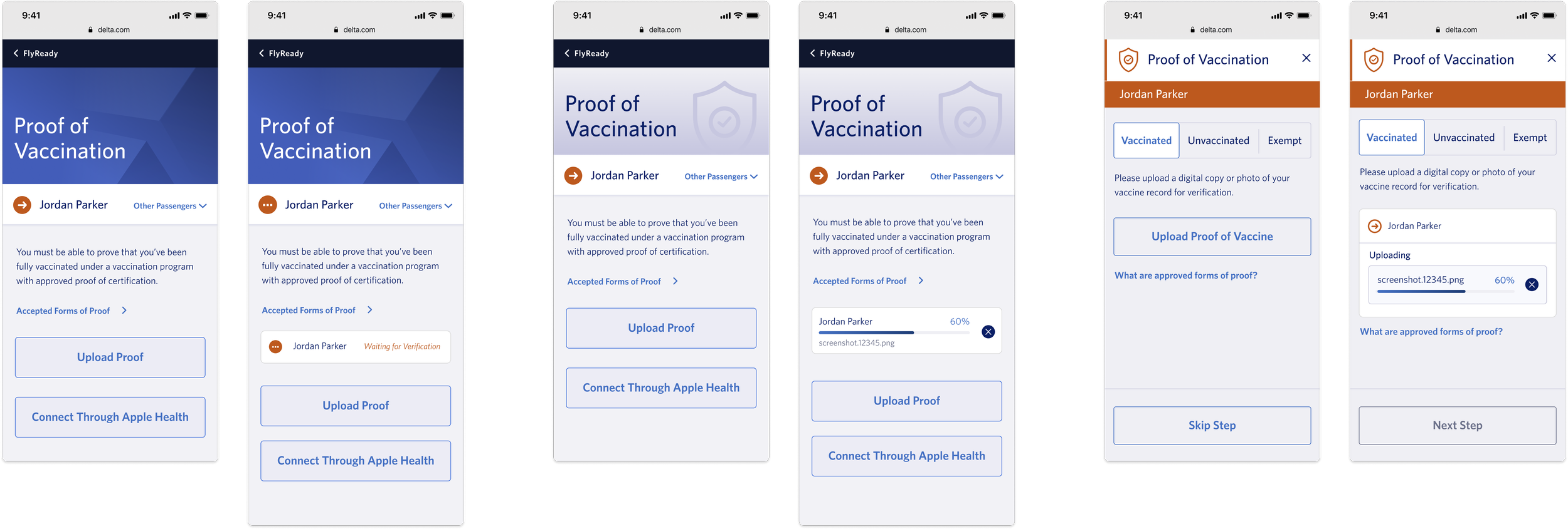
Each step on the initial landing page launches a modal where the user can upload the needed information for that step. Initial iterations focused on how to give users the functionality to upload a document as well as trying to hone in the visual look.
Early iterations were visually very close to the home page designs with the visual hero at the top of the mobile modal with the Delta branding. Users were also given the ability to switch between passengers within the modal so users could upload everyones document at once. For the mobile breakpoints, users were able to upload a document straight from their phone. For health documents we also added a button to connect to Apple Health since users had to ability to connect their vaccination records in there. This would have created an easy one step process for uploading their vaccination information.
Over the weeks privacy and technical limitations results in removing the connection to Apple Health as well as the ability to change passengers in the modal. Changing passengers was moved to the homepage because requirements could vary from passenger to passenger and it was easier to show those difference on the homepage. For example, if one of the passengers was below the age of 2, they wouldn’t need to upload proof of vaccination, so that step would automatically be complete for users. Requiring passport information prior to uploading other documents also made switching passengers within the modal a challenge.
Final Modal Designs
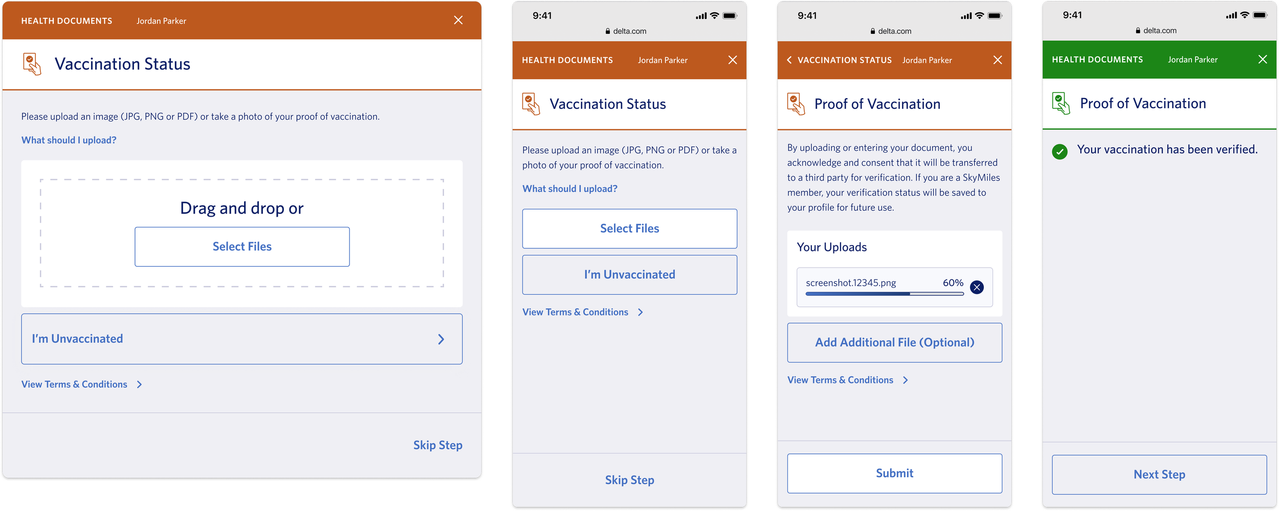
The final modal designs leveraged the colors used to show users what steps have been complete and what need to still be finished. The top header color changes based off of the status of the step and shows which passenger the user is uploading information for.
For document upload, a drag and drop feature was added to the desktop breakpoints so users could drag something easily from their files. The mobile breakpoints allow users to upload an image straight from their phone. Once a document begins uploading a progress bar was created to notify users if the document was uploaded successfully.
Once the document is uploaded and the system verifies is, the header and the step on the homepage are switched to green to show that it is completed. The user can then move to the next step in the FlyReady process within the modal instead of exiting out and selecting another button. Once all steps are complete the user can close out the modal and they are FlyReady!
Reflection
This was my first real world website experience so it was a great learning opportunity to see how to interact with clients. This was a really fast-paced project because the need to get this platform out was incredibly high for Delta. This led to a lot of fast iterating when it came to visuals and the overall style guide of FlyReady. It taught me a lot about the airline business and what is needed to travel and how complicated things had gotten with COVID.
The most rewarding part of this was that I was able to create a platform that made traveling easier for so many users. Traveling had become a really scary and stressful thing for many people and I love that my work was able to ease that stress for many people. The biggest thing I learned was how to start presenting my work to internal work teams and getting ready for client presentations. This was also the first project where I was able to see the full project through from start to development, so I was able to learn the ins and outs of delivering designs to a development department as well.
Overview
Time: 6 Months
Tools: Figma
Skills: UX/UI, Web Design, Prototyping, Presentation