Branding | Responsive Website Design | Animation | illustrations
Sapling is an e-commerce store that sends potted plants straight to your door.
“2019 AIGA Certificate of Merit in UX/UI” winner and the 2020 “Silver ADDY in UX/UI” winner
Logo iterations
I wanted the company to be fun and light-hearted, so the name Sapling was chosen. Sapling is a young plant, so that allowed for a more fun youthful feeling for the brand. During the first stages of logo sketches, I tried to combine a plant and a box to relate back to the company being a store. That direction wasn’t very effective though, so my next round involved me trying to combine the letter S and a plant leaf. The final logo is a Monstera leaf and an S combined. The color of the logo is a lighter green because younger plants are normally lighter than adult plants and wanted to relate back to the fun youthful vibe of the company.
Style guide
Illustrations
Due to the fact that the logo is so organic and the brand feel was fun and light hearted, I created vector illustrations of various plant leaves for the hero image and to be used throughout the website.
HOme page
The home page has a large hero with the illustrations I created. There is a short description of the business and how it was founded. For the featured products section, I wanted to use the organic shapes from the hero in a new way, so the background of the photos were cut into organic shapes and the illustrations were used throughout the page as well.
Store Page
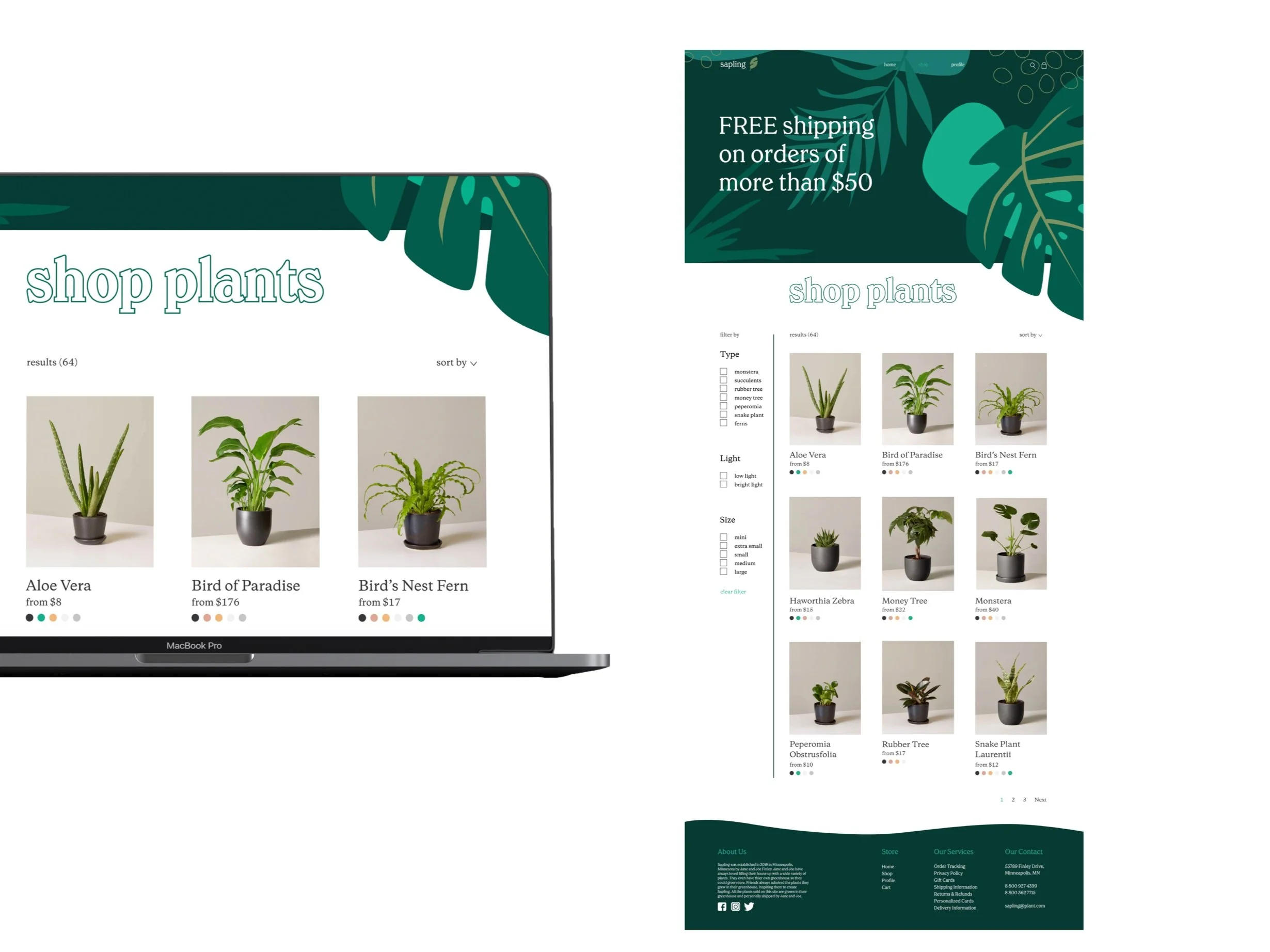
The store page allows the customer to filter through different types of plants as well as size and different light conditions. The customer can also choose what color pot they want their plant to come in.
Product page
The product page gives you all the information you would need on the plant, including amount of sun light and water that it typically needs. The organic background was used on this page as well to highlight the product.
Loyalty Page
The profile page allows you to become a sapling member. The customer can earn points through various ways and the customer can use those points to purchase items. There are three different membership levels depending on how many points the customer has earned.
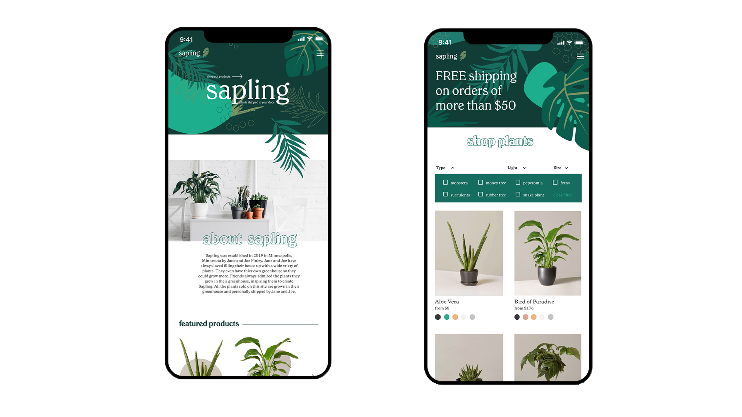
Mobile Site
animation
Reflection
When I went into this project, I thought it would turn out completely different. I learned through this project that you really need to make decisions based on the brand and not based on what you thought you were going to make. I struggled with making the logo for a while, and was relieved to finally settle on the idea of an S mixed with a leaf. But the logo was very organic and youthful, which didn’t align with the vision I originally had for the project. But the outcome was so much better than my original vision.
I was happy to be able to make illustrations and make the website more airy and free. I also learned that you shouldn’t keep the same layout when moving to mobile. My first round was very similar, and I realized that it made everything very hard to read and too small. One of my favorite parts of the project was getting to experiment with how objects would move in After Effects with my final animation.
Overview
Time: 4-5 Weeks
Tools: Figma, Adobe Illustrator, Adobe After Effects, Adobe Photoshop
Skills: Web Design, Illustration, Branding, Logo Design, UX/UI


